Safe Routes to School
Highlighting Transportation Safety

The Challenge
When the Transportation Agency for Monterey County (TAMC) was preparing to launch their Safe Routes to School (SRTS) program—a program that teaches students how to safely bike, walk, and carpool to school—we were brought in to create a brand for the program and collaborate on the creative direction and messaging for the ensuing website.
The Outcome
The resulting brand and website design connects with school administrators, and resonates with families, the community, and the children who enroll in these programs. The messaging feels inviting and playful, but also represents a local government agency that promotes safety while effectively administering programs for children.
Services
- Strategic Brand Building
- Content & Campaign Consulting
Focus Areas
- Education & Research
Brand Strategy Headline
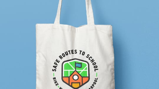
The brand needed to feel inclusive of the rural and urban areas within Monterey County. We drew on colors inspired by green bike lanes and transportation signage.
Brand Identity
The SRTS program consists of several sub-programs which could have sub-brands themselves. Funded by Measure X through TAMC, we saw the potential for brand confusion. We delineated the brand hierarchy with all of these aspects in mind, in order to avoid confusion.
Local Messaging
The SRTS messaging is designed to communicate with two primary audiences: schools and student's families & the general community. Because SRTS is a national program with a local focus, our messaging is specific to Monterey County and uses local stats and area references.
A Scalable Website
We designed two main pages that contain the components that SRTS anticipates adding to their website in the future.
Custom Icons & Illustrations
The icon set we created is intentionally playful to match the brand style.
Essential Style Guide
As additional SRTS programs are rolled out, our style guide provides them with a framework for maintaining brand consistency.
Intentional Information Flow
The website is focused around the Target Audiences we identified. With that in mind, the site was designed to direct audiences down the pathway most applicable to them, allowing visitors to quickly get to relevant information.
Empowering The Future
The SRTS team is working with a partner that has an in-house development team. Part of our work was to think through the website so that their team could develop the site moving forward.
Digital Style Guide
Due to the fact that the full site is being built by an external development team, we provided a detailed digital sticker sheet that defines the digital styles of the site.
Scope of Work
Strategic Brand Building
- Visual & Messaging Landscape Analysis
- Brand Messaging
- Content & Messaging Strategy
Content & Campaign Consulting
- Brand Extension, Collateral, & Materials
Other
- Strategy
- Visual Identity
- Icons & Illustrations