OF/BY/FOR ALL
Branding a Change Network

The Challenge
The Executive Director of the OF/BY/FOR ALL global movement came to us following our collaboration with the MAH. They had a big vision for what a change network could and should be, but needed our guidance to help distill their ideas into a unique and memorable brand.
The Outcome
We created a brand identity that clearly communicate's OF/BY/FOR ALL’s mission to civic and cultural organizations around the world. Through the use of our branding and messaging strategy, the global Change Network grew to over 40 members strong in its first year and is driving to add more organizations each quarter.
Services
- Content & Campaign Consulting
Focus Areas
- Arts & Culture
Intentional Iteration
We explored many different directions with the intention of creating a foundational logo that would be immediately recognizable and scalable. The design also had to allow the organization to have location specific branded logos (i.e. OF/BY/FOR Santa Cruz)
As the iterative process moved forward, we honed in on a crest look that felt traditional in format, but forward-thinking in its design.
Powerful & Interconnected Brand
The brand needed to feel like a force for action rather than a passive set of tools. It had to represent a movement. The nature of the brand mission also requires that it be inclusive to attract potential partners and the people their partners serve and wish to attract. The resulting brand projects strength and aligns with the organization's purpose and identity.
Due to the interconnected nature of the brand, we knew that the brand system needed to be clear, modular, and scalable. The mark is built from three structural hexagons that represent the OF, BY, and FOR elements. Together the shapes create a unified symbol that represents a powerful change network.
A Flexible, Extendable System
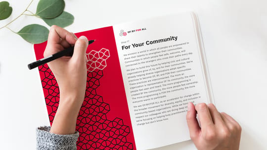
As with any brand, OF/BY/FOR ALL’s brand identity is much more than just a logo. To convey its complex and nuanced story and create a consistent brand experience, we created a detailed guide. Using brand extension samples we defined a unique and flexible design language that speaks to multiple audiences and satisfies varied use cases.
We used the structural format of the logo to create a bee icon that works as a badge. It represents the hive nature of the group and can be given to an individual or partner organization when they’ve done something particularly cool or impactful.
A Rapidly Growing Network
Scope of Work
Content & Campaign Consulting
- Brand Extension, Collateral, & Materials
Other
- Strategy
- Visual Identity
- Icons & Illustrations