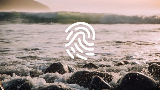
Oceankind
Reimagining Our Ocean's Future

The Challenge
Oceankind is an emerging funder in the Ocean Conservation and Innovation sector. They approached us to help them develop a strong foundational brand and message as they introduced their organization to the world publicly and to communicate their vision and positioning in a very saturated space.
The Outcome
We created a uniquely balanced brand and message that combines a centric feel with a technology-based approach. The results position Oceankind as an exiting new institution to help solve the most pressing problems affecting our Ocean.
Services
- Strategic Brand Building
- Content & Campaign Consulting
Focus Areas
- Climate Action & Environment
- Foundations & Philanthropy
Brand Inspiration
We walked a fine line with this design. The logo needed to clearly fit in the oceans space, yet stand out as an identity as unique as the organization. We wanted to avoid having it look like a tourism or surf brand while pairing well with potential partner logos in the ocean space like Oceana, MBARI, the Coral Reef Alliance, the Nature Conservancy, and the Monterey Bay Aquarium.
An entirely new organization, Oceankind was still developing its identity when we started the branding work with them. As often happens, the process helped them define how to express their ethos.
Understanding the Seascape
Our market research on the ocean conservation and philanthropy space was guided by the need for the brand to feel unique among philanthropies yet resonate with ocean conservationists, nonprofits, and foundations.
Because Oceankind funds research into technology-based solutions, the brand also required a techy vibe while still being approachable and human-centric.
Conveying the Right Message
We believe that positive messaging is more effective than scare tactics. But staying positive can be difficult when explaining the topic of declining ocean health. While it is important to express the problem, we feel that it’s more impactful to emphasize solutions.
As a result, we focused Oceankind's messaging primarily on their vision of a future in which oceans thrive, teeming with life and biodiversity that nobody on Earth today has seen.
Instead of dwelling on the problem, we developed messaging that expresses Oceankind’s unique place in ocean conservation, how they vary from other ocean philanthropies, and their unique approach and value proposition.
Many Directions
From the beginning, the Oceankind team encouraged us to explore and experiment. Initially, this gave us some wildly different logo directions. We grouped ideas into the OK Fish, Digifish, and Fingerprint themes, creating variations and honing in on elements that resonated with the Oceankind crew.
Final Brand
The final brand speaks to oceans with its distinct fingerprint wave shape. This combination reflects the human connection with oceans that drove the creation of the organization and inspires them to do the work they’ve taken on.
The icon set that accompanies the brand follows the logo style but uses two colors. The icons depict aspects of Oceankind's approach and methodology.
Staying On Brand
The final brand manual gives Oceankind a single source of truth for all of their design, logo, color, typography, and messaging decisions.
Scope of Work
Strategic Brand Building
- Brand Research
- Visual & Messaging Landscape Analysis
- Interviews & Focus Groups
- Brand Identity & Design Systems
- Brand Messaging
Content & Campaign Consulting
- Brand Extension, Collateral, & Materials
Other
- Strategy
- Visual Identity
- Icons & Illustrations