National Vote at Home Institute: EO Hub
Branding An Online Gathering Space

The Challenge
The EO Hub is a cooperative, nonpartisan online space where election officials and their staff gather to leverage their collective expertise and experience to solve problems and enjoy the camaraderie of colleagues who understand this wonky world.
A project of the National Vote At Home Institute, the platform was in the conceptual stage with a need for a visual identity and messaging. The brand had to feel unique, nonpartisan, and appeal to a wide demographic while being a recognizable sub-brand of NVAHI.
The Outcome
The completed brand and brand extension is inspired by the idea of a salon — a gathering of guests in a room to discuss important topics — and a modern speakeasy aesthetic. This combination is intended to invoke the sense of a professional, but casual community.
The messaging continues this theme being informative with bits of informal language sprinkled throughout to strike the right tone.
Services
- Strategic Brand Building
Focus Areas
- Policy & Advocacy
- Public Service & Government
- Social Equity & Justice
A Balanced Brand
Structurally, the EO Hub brand acts as a sub-brand of the National Vote At Home Institute (NVAHI). It’s purpose is to convey the sense of community that’s central to the EO Hub.
We designed the brand system to tick off several boxes including being trustworthy and relatable, while being approachable to both election officials who have been doing this work for decades and young people new to the space. The final branding feels welcoming and inviting, is intentionally nonpartisan, projects a relaxed yet professional attitude, and feels welcoming and inviting.
An Expressive Design System
Founded on the principles of cooperation and collaboration and inspired by schoolhouses, speakeasies, and cozy library colors, the EO Hub palette centers around “nonpartisan purple” and is supported by complementary colors that add gravitas to the brand expression. Together they create a welcoming, enticing, and familiar aesthetic that is also classic, timeless, and elevated.
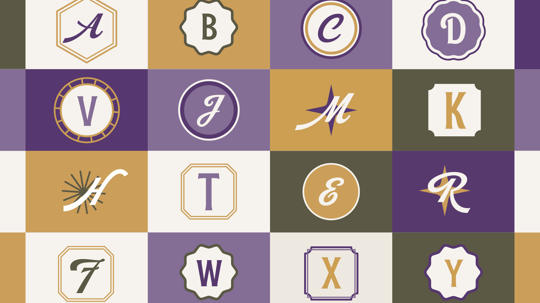
The EO Hub design system includes patterns and badges that can be used as avatars for social media or in swag.
The EO Hub typefaces are part of what makes the brand system and experiences feel memorable, crafted, and classic.
The primary typeface, Rough Cut, is a sturdy, approachable font inspired by vintage tin labels with subtle stylistic details throughout the letterforms.
The primary expressive EO Hub typeface is Robu — a classic, swashy script font inspired by vintage shop signs. It works well paired with Rough Cut and as accents throughout the EO Hub brand expression.
Halyard Text is the legible yet pleasingly distinctive and robust sans serif font that does the heavy lifting for copy and content.
Planning For The Future
The Robu font especially lent itself to the creation of an alphabet library that NVAHI could use throughout the Hub to introduce topics and themes. This gives the NVAHI team assets they can use for years without having to create new illustrations.
Serious Fun
The EO Hub illustration style is comprised of vintage and modern icons rendered in a minimal, monoline style. Illustrations contribute color, style, and a lighthearted aesthetic along with added energy, movement, and texture to brand touchpoints. They serve as a shorthand for the unique personality, values, and offerings of the EO Hub community.
Filling a Need
The Brand Narrative for the EO Hub is built around a need the the National Vote At Home Institute identified. In many places across the US, the number of people with in-depth experience as election officials is quite small. The EO Hub helps members connect with peers who understand this deeply wonky work.
Messaging Alignment
The messaging components of this project include everything from boilerplate language for journalists, press releases, and events to an Elevator Pitch that helps everyone in the organization use the same points when describing the EO Hub.
Setting Expectations
Hosted by the National Vote At Home Institute, the EO Hub’s voice needs to be distinct from the host organization. Part of that definition includes: “For the EO Hub specifically, our overall tone is slightly more casual than the tone established for the National Vote at Home Institute. We want the EO Hub to feel welcoming and valuable to election officials. As a result, our messaging leans toward the use of positive, inclusive, and inviting language.”
Long-Term Brand Continuity
In addition to describing best practices for brand usage, it’s important to provide rules on what not to do. Part of our detailed Brand Guidelines, these rules of the road will help any future content creators maintain brand consistency.
Scope of Work
Strategic Brand Building
- Brand Identity & Design Systems
- Brand Messaging
Other
- Visual Identity
- Icons & Illustrations