MAH
Museum 2.0 Goes Digital

The Challenge
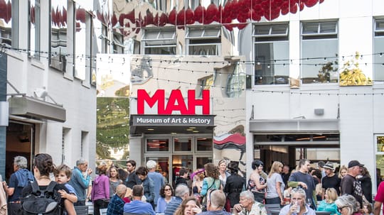
The Santa Cruz Museum of Art and History (the MAH) had evolved from a modest local museum to an internationally renowned community-centered participatory destination. They came to us asking for our help in creating a digital experience that matches their real-world Museum 2.0 environment experiences.
The Outcome
We created a new communications strategy and media-driven digital platform that encourages members to take action, increases the volume of corporate sponsorships, grows new and renewed memberships, and raises the number of rentals out their space—something they rarely had before the new site existed.
Services
- Strategic Brand Building
- Content & Campaign Consulting
- Digital Infrastructure
Focus Areas
- Social Equity & Justice
- Arts & Culture
The MAH marketing and communications team felt like the online experience was too passive and didn’t function as the inclusive conversion generator they wanted. They came to us for our help in translating the in-person experience of the MAH to a digital platform—one that leads to increased engagement and new memberships. Our primary strategy was to improve their storytelling and visual presentation prowess in order to drive online engagement.
Understanding Museum 2.0
We started with a diagnostic session with the MAH team, including the Executive Director. They described their challenges and laid out their aspirations for a new site. To more deeply understand the experience of visiting the museum, we took a guided tour of the entire space, conveniently located across the street from us. Back in our studio, we looked at the marketing efforts of other museums and similar organizations.
With our more in-depth knowledge, we developed a strategy for creating a website that is in sync with the community-centered museum.
A Shift in Messaging
Early on, we moved the focus of the messaging from a passive experience to active one. Today, a museum can’t expect people to walk in their doors just because they open them. They need to actively reach out to everyone in their email list and invite them to get involved. The MAH is a place that encourages diverse people from across the county to come together as a community and enjoy art in its many forms.
This lead to a 35 page Communications Guide that they now use to train employees and volunteers to communicate in a unified way. Using the Communications Guide has evolved every element of their communication, both written and spoken.
A Unified Brand Experience
Vibrant red and an iconic red ball sculpture on the corner where the museum’s located, provided our initial design inspiration. Pulling these existing elements into the website were a first step in creating a more consistent brand experience. We took that further and added subtle elements like rounded corners on cards and photos, and integrated their current fonts to give the site a unified aesthetic that matched their current brand.
A Streamlined Site
There’s almost always something to do at the MAH. They also have a decades-long legacy of programs, events, and exhibits. The tension between acting as a repository for the past and an organization putting on new events daily, had caused their site to be bloated and cumbersome. Having so much information at hand was overwhelming and a barrier to connection.
We took a photographic people-centric approach to presenting the MAH to the public. As a community organization, they need to communicate their acceptance of everyone they serve, regardless of culture, age, or economic status. The goal was to convey that the MAH is welcoming to all.
From Informational to Emotional
We made it easy to discover the latest exhibits, learn about events, and get excited about visiting the MAH. Our recommendation was to change the focus of event descriptions from simple information downloads to emotionally engaging, story-driven experiential descriptions designed to entice and inform.
Now I Can Do That!
With so much happening at the MAH it was vital to streamline the information architecture so that the website is easy to navigate. The results also make the site a breeze for the MAH staff to update and maintain. We built the site using Craft CMS which not only allows them to create and customize new pages on their own and easily change existing copy and images, but keeps the styling consistent through our customized page builder.
Scope of Work
Strategic Brand Building
- Brand Research
- Visual & Messaging Landscape Analysis
- Interviews & Focus Groups
- Content & Messaging Strategy
Content & Campaign Consulting
- Brand Extension, Collateral, & Materials
Digital Infrastructure
- Digital Blueprints
Other
- Strategy
- Icons & Illustrations
- Digital