Elkhorn Slough Foundation
Creating a Community-based Experience of a Nature & Research Preserve

The Challenge
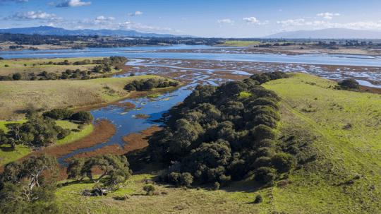
One of the last remaining protected estuarine wetlands on California’s central coast, Elkhorn Slough is a nature and research preserve that encompasses over 4,200 acres. They came to us with what they described as, “An old, complicated, inaccessible website.” It was a situation we have seen before where the evolution of a site over time makes it cumbersome almost beyond use.
In addition, the preserve involves the interactions and overlap of four different organizations and their messaging wasn’t clear about these relationships. They wanted to showcase the abundance of land and waterways that they currently preserve and invite people to visit, support, and get involved.
The Outcome
The new site highlights multiple aspects of Elkhorn Slough from the significant amount of research information for academics and the public, to recreational options, and the three-way partnership that supports the outstanding programs and expanded slough conservation efforts. The biggest lift was creating an easy-to-navigate site that includes over 70+ pages and more than a few photos and videos of the incredible wildlife there.
The updated brand, and visual identity give Elkhorn Slough a modern look and feel that aligns with the low-friction nature of the site. The written content shifted from distancing academic language to inviting community-based language that appeals to locals and visitors equally.
Services
Focus Areas
A Supportive Visual Identity
The overall visual identity is foundational. The logo is designed as a strong wordmark supported by horizontal lines that give the lockup structure and provide a container to hold meaning. Our goal was to keep the overall design language subtle, with all of the color choices and other design elements chosen to enhance the beauty of the place. To showcase the preserve, the site aesthetic is intentionally more focused on the location and visiting experience than the organizations behind it.
A Subtle Design System
The design system we devised includes subtle topography lines in the background of some sections that showcase the elevation of Elkhorn Slough GIS mapping that indicate where the land and sea meet. This occurs throughout the site as a visual reminder of the special and unique interaction that occurs in the preserve.
In keeping with the topographic lines, many elements of the site are rounded including corners of photos, inset information sections, and buttons. Color plays an intentional role across the site with pages associated with Elkhorn Slough Reserve featuring green backgrounds, pages for the Elkhorn Slough Foundation utilizing a rich blue, and Visitor pages grounded in a welcoming gold.
Supportive Iconography
Nature-based iconography is used across the site to add visual interest to stats and other factual information. With sea otters and many varieties of birds calling Elkhorn Slough home, we had lots of inspiration to draw from.
Designing Content Pathways
One of our primary tasks was to create distinctions between the Elkhorn Slough Reserve, the Elkhorn Slough Foundation, and adding an extensive Visiting section to the site — a feature the Elkhorn Slough team wanted to add to encourage more community engagement. The information architecture supports this approach along with the visual choices, creating a cohesive experience from the primary navigation to every element of the site.
Site Development that Integrates Valuable Content
Developing the site includes some interesting challenges. In addition to the clear delineation between the Foundation and the Reserve, a significant amount of information needed to be migrated from the previous site, including scientific research pages, education programs, stewardship projects, scientific articles, and presentations. It was a challenge to reduce friction on the core pages and allow for content-heavy pages deeper within.
A Balanced User Experience
For an information-rich site, one challenge was making the site compact and refraining from the temptation to have long scrolling pages packed with in-depth information. Knowing that people scan until they find a topic they want to explore, we struck a balance using teaser sections that give people subject overviews with links to immersive text pages.
The Support Our Work page is a particularly good example of this type of experience design with subtle photo attribution and teaser sections that allows for overviews that link to detailed information.
Virtual Exploration
The site employs a compelling digital experience in the form of an interactive map on the Homepage. It starts with a clear invitation that draws site visitors into an experience that provides organization information and recreational highlights. Overall, it provides a clear sense of space and boundaries of the reserve in a fun way.
Research Availability
As a research organization, the Elkhorn Slough Reserve conducts research and publishes the results. The volume of existing research required a careful approach to content that allows access while preventing overwhelm. One of the most challenging integrations was adding the existing research archive and surfacing the ongoing research and monitoring efforts happening today.
Expressing the Essence of a Place
The headlines found throughout the site showcase how branded copywriting can express an organization’s culture and identity.
There’s also a very human element to the copywriting. By acknowledging something as simple as how to pronounce the word “slough” signals to people that the organization’s culture is friendly and welcoming.
Scope of Work
Other