EarthRights - Frontlines of Climate Justice
Empowering a Campaign of Awareness and Hope

The Challenge
Since 1995 EarthRights International has grown from three employees in a tiny office in Kanchanaburi, Thailand, battling a notorious oil company into a global movement united across three continents.
They contacted us with the desire to create a distinct brand and unified messaging for their climate justice campaign. Titled Frontlines of Climate Justice, the campaign is an extension of their work supporting Indigenous communities in their resistance to climate-destroying fossil fuel development, mega-development projects, and deforestation.
The Outcome
The resulting brand and messaging align with the overall EarthRights aesthetic and mission. With a stance that evokes the type of frontline activism that the campaign supports, the campaign brand provides strong symbolism to rally around.
Services
- Content & Campaign Consulting
- Strategic Brand Building
Focus Areas
- Climate Action & Environment
- Policy & Advocacy
- Education & Research
- Arts & Culture
Turning the Conceptual into the Concrete
In order to turn the ideas behind the campaign into a visual identity, we developed a series of moodboards to dial in the direction of the brand’s look and feel. This process allowed us to push our creativity, explore bold ideas, and ultimately find the perfect approach to the brand identity and expression.
An Impactful Visual Identity
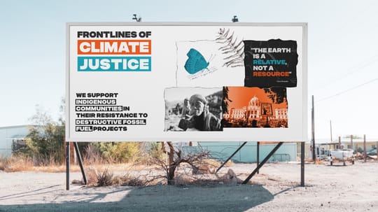
The Frontlines of Climate Justice logotype (Logo) is a succinct, impactful, and recognizable wordmark created with bold geometric lettering and rectangular container shapes, giving it a strong, powerful, and authoritative presence.
Attention-Grabbing Illustrations
Aspects of the mood boards were refined to establish a collage illustration style which feels actionanable.
The illustrations highlight several themes — Indigenous communities, climate, charts and graphs, art from one of their events, and justice juxtaposed to draw audiences into the content.
Even with the serious subject matter, the illustrations lean toward the positive and hopeful with the use of plants, animals, butterflies, and other images of nature.
A Bold Brand Choice
The brand extension makes use of Folsom, the primary font, which gives the brand a bold, impactful, and strong visual voice. A bold, geometric, all caps font, Folsom forces the reader’s eye to slow down and take in the words carefully.
We combined the Folsom font with the illustrations to develop a set of posters and social media assets that are both powerful and intriguing.
A Single Source of Truth
With multiple content creators within the organization, a Brand Style Guide is essential to maintain brand integrity both visually and through written copy.
The Story of the Campaign
Frontlines of Climate Justice is a campaign of EarthRights International. We collaborated with their Communications and Campaigns teams to develop a campaign narrative that puts the campaign front and center while acknowledging long-term effectiveness of the larger international organization behind it.
Unified External Messaging
Derived from the Brand Narrative and the overall messaging elements we developed with the EarthRights team, the brand messaging provides them with ready-made language for events, programming, and journalists. This helps their external message remain consistent, regardless of use case.
Inspiring Tight Messaging
We worked with the EarthRights team to define the voice, tone, and overall Communications Guide to ensure consistent messaging across the campaign. In addition to encouraging a unified campaign personality, these rules of the road give all communications efforts a jumpstart.
A Complete Campaign Kit
The logotype, colors, illustration style, typography, messaging, communications guidelines, and premade posters and social media assets, equips EarthRights International with a complete brand toolbox containing the elements they need to create ongoing campaign assets and website components.
Campaign Ready
As the EarthRights International team rolls out their campaign, they have everything they need to create visually compelling website pages, blog articles, and real world assets for use by advocates on the frontlines of climate justice.
Scope of Work
Content & Campaign Consulting
- Brand Extension, Collateral, & Materials
Strategic Brand Building
- Brand Identity & Design Systems
- Brand Messaging
Other
- Visual Identity
- Icons & Illustrations