Community Foundation Santa Cruz County
Inspiring Community Impact

The Challenge
Since 1983, Community Foundation Santa Cruz County has evolved to become a center for funding across Santa Cruz County. To heighten their impact, they sought a modern digital presence and new messaging designed to create a satisfying experience, inform donors and nonprofits, and inspire generosity county wide.
The Outcome
Powered by a new messaging and content strategy that clearly tells their story and conveys their community value, our solution inspires giving through a frictionless donation experience. Each of their main audiences can easily get involved and take action without getting overwhelmed.
Services
- Strategic Brand Building
- Content & Campaign Consulting
- Digital Infrastructure
Focus Areas
- Foundations & Philanthropy
Unique Positioning
To most effectively deliver the Foundation’s message, we investigated current visual and messaging presentations used by community foundations across the US. Our goal was to create an online experience that looks distinct to Community Foundation Santa Cruz County and expresses their specific message.
Who We Serve
Community foundations don’t compete with each other, but there is competition for donations from local nonprofits as well as from advised fund investment products. Because the Foundation gives grants to local nonprofits, their primary audience is donors. We focused our efforts on this audience, as they support the mission of the Foundation.
Nonprofits that receive funds from the Foundation are an important secondary audience.
Simple & Direct
Although the site contains a lot of information, our goal was to avoid overwhelming site visitors and help them get to the most important interactions and information quickly. To simplify and optimize the site for donors, the main navigation is limited to the four most important sections + a persistent call to action to 'Give'.
A robust footer and intelligent, ranked search allows site visitors to dive in quickly and deeply. This results in a site that always feels light and spacious while providing in-depth information.
A Better Donation Flow
The Foundation oversees more than 350 individual funds. The sheer volume of funds was a barrier to people who wanted to give to the causes most important to them. We decided to group similar funds together, reducing the options down to 10 types of funds. Of course, supporters still have an option to give to a specific named fund, such as a Fund for Women and Girls or a Fund for Health, if they wish.
Inspiring Confidence
Philanthropy involves two powerful aspects of decision making: emotions and logic. People donate because they care and because donating makes them feel good. They also want to make informed decisions about the reliability and efficacy of the organizations they support. The site design is intended to work on both levels. The emotional aspects of the site are largely photo driven.
The site was built using a component-first design and development approach in order to provide a ton of flexibility for content creators—something lacking in their previous site. It also gives them the ability to create new, unique pages themselves that match the style of the site without breaking the visual language of the design.
The data pages are minimalist with clear access to in-depth statistical information. Componentized elements allow maximum flexibility while maintaining consistency.
It’s About People
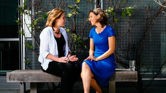
We shot photos over two days to give the site a local and personable feel. Ultimately, philanthropy is about people, and we wanted to showcase the people behind the Foundation as well as some community members who benefit from their work.
Elevating The Experience
While the organization has evolved over the last few years, the messaging on their site hadn’t kept pace. With the overall guidance to Inspire Community Impact, we worked with the Foundation team to rewrite the site from the ground up.
We wanted the language to feel more welcoming and inclusive. We wanted people to be able to give to their passions in any way that they could. Most importantly, we aimed to soften the language and make it more casual. Our goal was to align the experience of talking with the people at the Foundation with the experience of visiting the website. The challenge was to find the right balance of casual yet professional.
Getting On The Same Page
Included in the Brand Style Guide, the overall messaging for the organization acts as a guide for existing and new employees when they set out to create new website elements or produce any other external or internal communications.
Putting It All Together
In order to clearly define the brand for the entire organization, we created a Brand Style Guide that describes the correct parameters for use of the various brand elements including the logo, its icon version, and the background patterns used on the site. Each component of the website is defined and the rules for use are called out.
The Brand Manual specifies the brand colors and typography to be used throughout the organization. It also identifies the types of photos to be used across the site and in additional collateral and provides guidelines and examples of different use cases.
Scope of Work
Strategic Brand Building
- Brand Research
- Visual & Messaging Landscape Analysis
- Brand Identity & Design Systems
- Content & Messaging Strategy
Content & Campaign Consulting
- Brand Extension, Collateral, & Materials
Digital Infrastructure
- Modern Bespoke Website Design & Development
- Digital Blueprints
Other
- Strategy
- Icons & Illustrations
- Digital