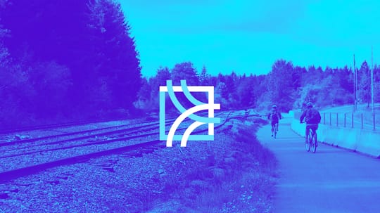
Coast Connect
Launching a Grassroots Campaign

The Challenge
The Friends of the Rail and Trail (FORT) team have been advocating for a sustainable, modern mass-transit system for Santa Cruz County for over 20 years. With a need to shift from a policy-focused approach to a community-powered, grassroots campaign, the FORT team brought us on as a strategic partner to develop and guide a new action plan.
The Outcome
From naming, messaging, and visual branding to technology consulting and launch strategy, our collaboration empowered the FORT team to navigate the next critical chapter of their progress using thoughtful strategies and a comprehensive campaign toolkit packed with visual assets.
Services
- Strategic Brand Building
- Content & Campaign Consulting
- Digital Infrastructure
Focus Areas
- Climate Action & Environment
- Public Service & Government
- Health & Human Services
Organized by the Friends of the Rail and Trail (FORT), the short-term campaign goal is to influence the outcome of an Alternative Analysis in favor of the rail & trail option.
The long-term campaign goal is to transform the rail corridor into the backbone of a robust and modern county-wide transportation system that provides maximum mobility, easy access throughout the county, and serves as many people as possible.
Having operated as a big-picture organization formerly 20 years, their board approached us to brand their first campaign and create new messaging to move their cause forward.
Visual Differentiation
The campaign needed both a name and a visual representation. We established a set of guiding principles for both the brand and messaging that included:
- A name that could also be the name of the transportation system
- A desire to serve everyone across the county
- The need for a transportation system that provides equity
- A logo and wordmark that creates a sense of rails, connection, and movement
Multiple rounds of fun collaboration were needed to create a name that ticked all the boxes.
As with many advocacy efforts, there are competing perspectives and players. These conditions called for a visual brand with a distinctive and memorable color pallet that made the campaign stand out from competing efforts.
The brand needed to emphasize the larger transportation vision for the county while also working for the short-term campaign. Lastly, due to the bilingual nature of Santa Cruz County, the brand and name needed to communicate in both Spanish and English and among local subcultures.
Creating a Brand Hierarchy
We encouraged the organization to draw clear distinctions between the FORT parent brand and the Coast Connect campaign brand and establish a clear parent-to-child brand relationship.
We recommended that they lead primarily with the Coast Connect campaign brand for all public outreach and use the parent brand only when working with elected officials and county-wide decision makers who had a strong connection to the organization.
Of course there are some use cases where co-branding is required. With this in mind, we were careful to ensure the Coast Connect color pallet didn’t clash with the parent brand colors.
Reframing the Cause
The launch of the campaign was an opportunity to re-frame the discussion about the cause. Collectively they decided to move from specific hot-button topics like the rail & trail and trains, which encounter preconceived bias, to the wider topic of county transportation solutions.
We transitioned the campaign away from talking about trains to using the term ‘rail transportation’. Trains evoke negative opinions in some people, yet the selection of the vehicle is years away and there will likely be many options when it’s time to choose.
We also encouraged the organization to change their overall tone from defensive and aspirational to being positive and action oriented. The overall rail corridor plan has already been approved, so taking the position that this project is moving forward is more powerful than constantly defending it.
Went with a values approach in their central messaging, leaning on shared community values of equity, sustainability, and economic opportunity for all.
To encompass all of these ideas, we created the tagline “Transforming Transportation” to give the campaign a central idea to rally behind.
Gaining Insight
To get an understanding of the Coast Connect cause, we interviewed local community leaders, business owners, the CEO of the Santa Cruz County Chamber of Commerce, and the former Executive Director of the Santa Cruz County Regional Transportation Commission—the organization that makes decisions on the project.
We also researched other transportation-related organizations to find excellence in the space that could serve as inspiration.
Establishing Brand Unity
Our work resulted in a brand asset toolbox that allows Coast Connect to move their campaign forward. To ensure that the brand presentation remains consistent over time, we provided a guidebook that describes all of the visual and messaging elements that we produced.
The guidebook includes inspiration for brand extension such as poster mockups and a shoulder bag—which was popular with the Coast Connect team.
Scope of Work
Strategic Brand Building
- Interviews & Focus Groups
- Brand Identity & Design Systems
- Naming
Content & Campaign Consulting
- Brand Extension, Collateral, & Materials
- Awareness & Growth Campaigns
Digital Infrastructure
- Digital Blueprints
Other
- Strategy
- Visual Identity
- Digital